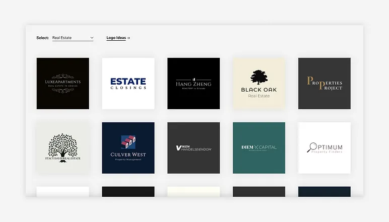
Types of Logo for Real Estate | Perfect Symbol for Your Brand

Logo Design
Types of Logo
Real estate is an extremely competitive industry, making a memorable and trustworthy impression crucial. Logos play a central role in creating this impression and as real estate landscape changes so do trends in logo designs; here we explore these recent changes that are revolutionizing how these symbols are utilized within this sector.

1. Minimalism Reigns Supreme

Minimalist logo designs have gained widespread acceptance within the real estate world. This approach to logo creation features clean lines, basic shapes, and uncluttered designs with minimal embellishment or distractions to project modernity, simplicity, and professionalism – characteristics which resonate well with modern real estate firms committed to transparent transactions.


2. Geometric Shapes for Accuracy

Geometric shapes have become an integral component of real estate logo designs. Triangles, squares and hexagons all lend a sense of balance and structure; they symbolize trust and reliability that are so integral in real estate business operations; as well as creating more sophisticated and upscale looking logos.


3. Negative Space Utilization

Negative space refers to the area surrounding and between objects in an image, making up about 30% of an overall image’s area. When used strategically in real estate logos, negative space can create secondary images or messages – for instance a carefully placed gap could form the outline of a house within it – adding depth while subtly communicating a brand message – something many real estate firms find attractive.


4. Dynamic and Versatile Typography

Typography extends far beyond just company names; it can also be integrated into logos themselves. Today’s real estate logos often employ custom and dynamic fonts that embody their brand personality, providing personalized touches while being versatile enough for use both with and without graphics in marketing materials.


5. Color Scheme Based on Earthy and Natural Elements

At one time, real estate logos often featured more traditional colors like blues and grays; however, recent trends show a shift toward earthier tones such as warm browns, forest greens, and deep blues that create an environment-inspired feeling – especially those targeting eco-conscious housing companies or sustainable real estate developments.


6. Vintage and Retro Inpirations

Real estate professionals frequently deal with selling older or historic properties. This has lead to a revival of vintage- and retro-inspired logos featuring aged color palettes, classic fonts, iconic imagery and nostalgic elements like aged color palettes or fonts; creating logos which evoke nostalgia while conveying timelessness – both powerful branding tools.


7. Versatile Monograms

Monogram logos have made a comeback in real estate logo design. Monograms provide a distinctive and memorable visual identity while remaining highly versatile enough for use across various marketing materials.

8. Reflecting Local Identity

Real estate firms have always been deeply rooted in their communities; therefore, logo designs that incorporate local landmarks or symbols have grown increasingly popular as an effective way of connecting with local populations and emphasizing expertise within that community.

9. Creative Use of Negative Space

Real estate logos that utilize negative space creatively have become increasingly popular, often including subtle yet meaningful hidden elements or messages within them that add depth and make the logo even more memorable.

Types of Logo for Real Estate: Choosing the Perfect Symbol for Your Brand

1. Wordmark Logo A wordmark logo, also known as a logotype, features your company name in an elegant font to emphasize it and highlight it. This option is simple yet effective for real estate agencies looking to stand out.
Keyword Density for Real Estate Logo Design Advantages:
Clarity: Ensuring that the company name is clear and easy for employees to recall.
Memorability: An effective wordmark design can create lasting associations.
Versatility: This logo design can easily adapt to a range of marketing materials. Examples include Century 21 and Coldwell Banker.
2. Lettermark Logo A lettermark logo incorporates initials or acronyms of your business’s name into an attractive visual design to convey brand identity in a compact yet memorable symbol. These benefits make lettermark logos popular choices among companies in Gurgaon.
Simplicity: Lettermark logos offer simplicity to long or complex brand names or companies by condensing their message into something easily remembered and timeless.
Versatility: Lettermark logos work across platforms seamlessly.
Memorability: When designed carefully, lettermarks can become highly memorable symbols such as Keller Williams or Sotheby’s International Realty’s.
3. Emblem Logo The emblem logo combines an icon or pictorial element with a company’s name in one visual component, usually within a shape or badge for an effective, cohesive appearance. Typical keywords used when searching for graphic designing companies in Gurgaon : umplut It also offers additional advantages when considering visual consistency within its design – for instance keyword density is much lower and benefits include branding within a shape. Professionalism and Tradition: Emblems exude professionalism and can convey a sense of tradition.
Uniqueness: With numerous options for customization and unique design available to them, emblems provide plenty of opportunity for unique design.
Branding: They can also be used for branding purposes on merchandise – some examples being Better Homes and Gardens Real Estate and RE/MAX.
4. Abstract Logo Abstract logos feature an abstract symbol or icon that represents their brand without directly being associated with its name, but nonetheless communicate its core message. They require strong brand recognition in order to function fully.
Benefits: In terms of originality and differentiation in an increasingly competitive market place, abstract logos stand out amongst competition.
Versatility: Abstract symbols can adapt easily to various marketing materials, while their visual impact makes them highly memorable when associated with brands (Berkshire Hathaway HomeServices and Compass are two examples).
5. Combination Logo A combination logo incorporates both text and a symbol or icon for maximum versatility and recognition of brand name, while creating memorable visual elements. These benefits can provide clear brand names while at the same time giving room for creativity through emblems that combine recognizability with creativity. Consequently, its advantages include: * Versatility of use * It marries recognizability with creativity to provide the ideal solution Comprehensive: Combination logos provide the opportunity to communicate more information about your brand.
Professionalism: They’re professional choices suitable for various real estate businesses like Remington Homes or Zillow.
6. Mascot Logo Mascot logos feature an image or character to symbolize their company, making them easily recognizable within an industry like real estate. While not as common in this sector, mascots can make brands memorable and easily relatable for potential buyers and tenants. There can be numerous advantages associated with these types of logos for real estate firms:
Memorability : Mascots can easily become instantly recognisable to both newcomers and current tenants alike.
Distinctiveness: Logos set your business apart while making it more approachable, while Mascots allow for customization and storytelling.
Examples: Not often seen in real estate but widely utilized across other industries. Selecting the Appropriate Logo for Your Real Estate Firm (pdf). Now that we have discussed various logo types, how can you select one for your real estate business?
7. Below are a few steps you should follow when making this selection: Its Understand Your Brand: Before choosing any particular logo style for your real estate firm, reflect upon its values, mission and unique selling points as well as any messages it should convey through its symbol.
Knowing Your Audience: Think carefully about who your target audience is and what appeals to them when designing your logo. Your logo should resonate with potential clients and resonate well.
Simplicity Matters: Keep it straightforward as complex logos may be difficult for clients and staff to recreate and remember.
Versatility: Make sure the chosen logo type works across a variety of platforms and materials, from business cards to digital ads. Professional Design: Consider investing in professional logo design as an investment for brand success.
Test Your Logo: Before finalizing your logo design, test it with a focus group or solicit feedback from peers and potential clients.

Conclusion

In conclusion, selecting the right logo for your real estate business is a crucial decision that should align with your brand’s identity and resonate with your target audience. Whether you opt for a wordmark, lettermark, emblem, abstract, combination, or mascot logo, each type has its unique strengths and can be tailored to represent your brand effectively. Remember that a well-designed logo is an essential tool for building trust, credibility, and recognition in the competitive real estate market.   

Visit Us at Instagram- Prettify Creative

Have a look at our Graphic Design Portfolio- Portfolio
Yes, Prettify Creative can create your New Logo best suiting for your Brand.
Prettify Creative has Expertise in Logo Designing Ranging more than 7 Years, and It can Certainly some of the most minimalist and attractive Logos

You can call anytime according to your convenience and comfort, or you can visit us between 9:00 AM in the morning up until 9: PM in the evening.

at:  804A, Unitech Arcadia, South City 2, Sector 49, Gurgaon  

Tags :
Logo Design
Share This :

Leave a Reply

Your email address will not be published. Required fields are marked *